Connect with us

UX/UI & Webdesign

Mehr Type, bitte! Monotype zeigt, wie wichtig Schriften auf Social Media sind › PAGE online


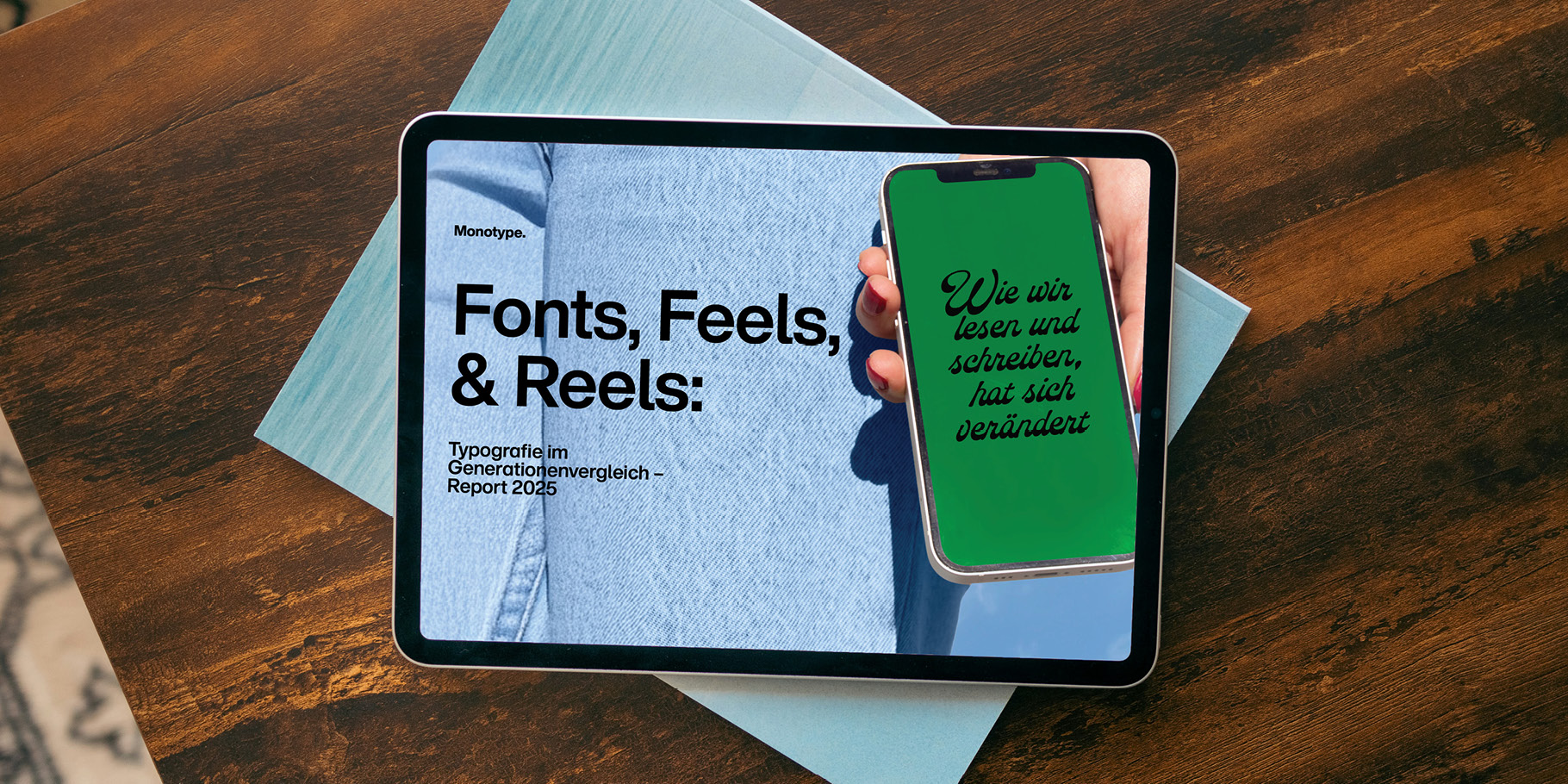
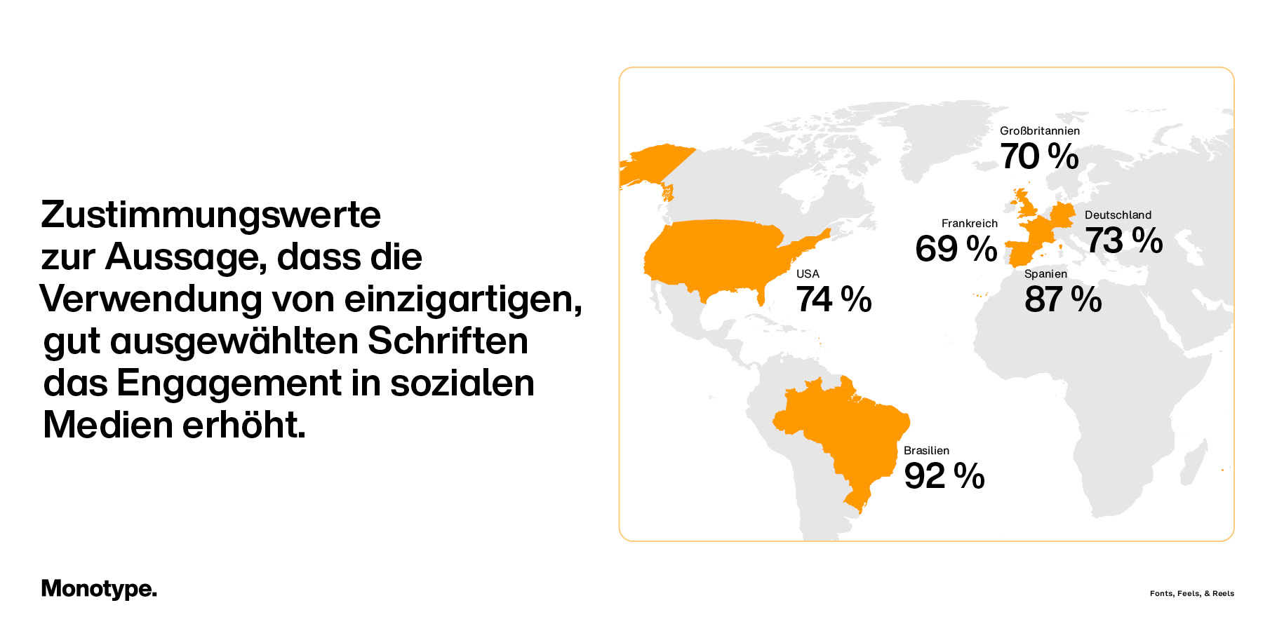
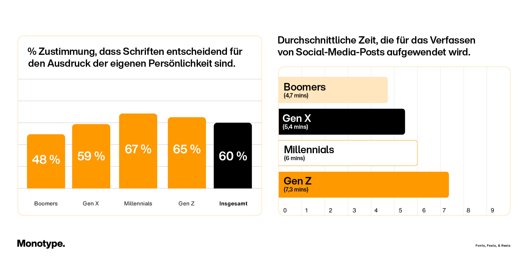
Junge Generationen setzen stärker auf individuelle Schriften – doch relevant sind sie laut Monotypes neuer Studie für alle, die auf Social erfolgreich sein wollen

Ein iPad mit dem Monotype Report liegt auf einem dunklen HintergrundBild: MonotypeAnfang des Jahres kündigte Monotype mit dem Re:Vision Trendreport an, stärker nach der kulturellen Bedeutung von Schriften im Kontext von Gesellschaft und Tech zu fragen. Die neue Studie Fonts, Feels & Reels beschäftigt sich deshalb intensiv mit der Nutzung und Wahrnehmung von Typografie auf Social Media. Spannend: der Need nach individuellen Schriften steigt mit jeder Generation.

Type is not dead!

Für die Studie befragten Monotype und Censuswide 12.000 Social Media Nutzer:innen aus sechs Ländern und vier Generationen zwischen Boomern und Gen Z weltweit – 3000 pro Generation, 2000 pro Land.

Die wichtigsten Erkenntnisse: Über alle Befragten hinweg fanden 69 Prozent, dass die Schriftwahl entscheidend für die Erstellung von Social-Media-Beiträgen sei. Besonders die jüngeren Millenials und Gen Z legen besonderen Wert auf individuelle Schriften und empfinden sie als relevant dafür, sich auf Social richtig ausdrücken zu können.

Zudem sahen 78 Prozent der Befragten gesteigerte Interaktionen, Likes, Shares und Kommentare, wenn sie ihrer Meinung nach die passende Schrift für einen Beitrag ausgewählt hatten. Und auch für Markenkommunikation spielt die Schriftwahl auf Social weiterhin eine entscheidende Rolle. So gaben rund 70 Prozent der Gen Z an, dass Schrift ihre Wahrnehmung eines Posts positiv oder negativ beeinflusse. Bei Gen X und Boomern wird es mit 52 und 37 Prozent deutlich weniger darauf geachtet.

eine Inforgrafik die zeigt, wie viel Zustimmung die Aussage, das Type über den Erfolg eines Posts entscheidet, zustimmenBild: Monotype

Generation Social?

Diese Generations-Unterschiede entstehen laut Monotypes Studie durch verschiedene kulturelle Hintergründe und Social-Nutzung. So seien Boomer vorrangig Spontan-Teiler und investierten in der Regel am wenigsten Zeit pro Post, teilten dafür aber häufiger. Gen X als Brückengeneration neige dazu, stärker die Schriftauswahl anderer zu bewerten und investierte mehr Zeit in anderen Tools, um ihre Posts zu gestalten.

Ein starker Sprung wird dann wahrnehmbar zu Millenials und Gen Z, die beide nativ oder über weite Strecken der Kindheit mit Social Media aufwuchsen. Millenials experimentieren laut Monotype viel mit Schriften und sind kritisch in ihrer Wahrnehmung. Für die Gen Z sei das Posten fest integrierter Bestandteil des Alltags und die Schriftauswahl essenziell für die Wahrnehmung einer Marke und ihrer Social-Bubble – und sie ist wesentlich unzufriedener mit der eingeschränkten Schriftauswahl in gängigen Social-Tools als andere Generationen und investiert schon auch mal Extra-Zeit in einem Kreativtool für den perfekten Post.

Zwei Infografiken, die die Relation zwischen zeitwuafwand für einen social post und Wertschätzung von Typografie zeigenBild: Monotype

Internationale Unterschiede und Learnings

Wie immer lassen sich aber die Generationen nicht vollständig generalisieren. Ebenso wichtig wie das Alter ist laut Monotype die Herkunft der Befragten. Deutschland steht im bei der Bewertung von Markenkommunikation im Ländervergleich auf Platz 2 der Typo-bewusstesten Länder. Brasilien auf Platz 1.

Dort maßen rund 89 Prozent der Gen Z und 91 Prozent der Millenials den Schriften in ihren Social-Posts eine entscheidende Bedeutung bei – wer also auf Social kommuniziert, sollte sich bewusst sein, dass die Schriftwahl nicht nur über Generationen hinweg unterschiedlich wahrgenommen wird, sondern vor allem regionale Unterschiede und Trends berücksichtigen sollte.

Monotype schließt deshalb die Studie mit einer Reihe an Learnings und Empfehlungen für verschiedene Nutzer:innen ab – von Tech-Dienstleistern über Marken bis hin zu Creators. Den ganzen Report zur Studie findet ihr hier.

Das könnte dich auch interessieren


Source link

UX/UI & Webdesign

Julie Joliat’s Kalender 2026 › PAGE online


Auch 2026 leuchtet der Kalender der Berliner Grafikdesignerin Julie Joliat in verschiedenen Farben– und folgt einer neuen Idee: In herrlich reduziertem Design lässt er einen in interessante Fragen abtauchen.

Julie Joliat’s Kalender 2026 › PAGE online

Es ging bisher um Glück, um schräge Fakten oder darum, entspannter durch Jahr zu kommen, bunter oder auch mal begleitet von Simple Pleasures und in einer Special Edition ginge es sogar mal an den See:

Jedes Jahr lässt sich Julie Joliat, Grafikdesignerin aus Berlin, die es zwischendurch immer wieder in ihre Heimat Zürich zieht, etwas Neues einfallen, um einen durch das Jahr zu begleiten.

Und das in Taschenbuchgröße, in den schönsten Farben und im feinlinigen Design.

Für 2026 trägt der Kalender den Titel »day one to one day« und präsentiert sich mit einem leuchtend pinken Innenleben und unzähligen feinen Details.

Spannendes Grübeln

Neben Wochen-, Monats-, Jahres- und Projekt-Übersichten, viel Platz für Notizen (inklusive 18 blanko-Seiten), Mondphasen und Umrechnungstabellen, startet er jede Woche mit einem Satz oder einer Frage, über die es eine Freude ist, nachzudenken.

Und die mit einem Blank Space Platz bietet, seine Antwort einzutragen. Und der Weißraum darunter, seine Gedanken weiter schweifen zu lassen, etwas zu zeichnen, zu notieren oder einfach leer zu lassen.

Natürlich kann über die Selbstreflexion hinaus auch mit Freund:innen über die Fragen reden, gemeinsam grübeln, sich austauschen. Jede Menge Erkenntnis inklusive.

»A golden moment worth turning into a recurring moment was when ______«, »If my pet (or houseplant) could talk, it would tell me to ______« oder »The best advice I ever received was _______«

Gemeinsam durch 2026

Zeigt sich auf einer Doppelseite eine Woche, sind Tage und Daten auf besondere Weise dargestellt – und das so kunstvoll wie reduziert: in jeder Zeile finden sich Wochentag samt Monat und Datum abgekürzt: tu/jan 08 heißt es da oder sa/jul 11.

Gleichzeitig sind die Seiten wie in einem Buch durchnummeriert.

Ganz darauf konzentriert, viel Weißraum zum Atmen zu lassen, ist der Kalender so reduziert wie selten zuvor. Er verzichtet auf Illustrationen und konzentriert sich stattdessen ganz auf die Linienführung und die Flächen und hebt das alles durch das leuchtende Pink hervor.

Und nimmt einen so auf besonders schöne Weise mit auf die Reise durch 2026, mit all seinen Terminen, Ereignissen, Erlebnissen und Erkenntnissen, die man darin Tag für Tag festhalten kann.

Day One To One Day, Englisch, 12 mal 19 Zentimeter. 192 Seiten und in grünem Chlorophyll (Grün), in hellgelbem Vanille und lilanen Berry Milk erhältlich. Bindung: Softcover, das beim Aufschlagen flach aufliegt, Cover aus strukturiertem Papier. Gedruckt auf Recycled FSC ® Papier, Chemie freie Tinte, Klimapositiv, Vegan, plastikfrei und Cradle to Cradle Certified ® zertifiziert. 28 Euro 

Der Kalender ist in Julie Joliat’s Webshop erhältlich. Genauso wie neue Produkte und ein neuer, undatierter Kalender.


Source link

Weiterlesen

UX/UI & Webdesign

Landeshauptstadt Schwerin erhält neues Corporate Design


Die Landeshauptstadt Schwerin steht vor der Einführung eines neuen Corporate Designs. Künftig werde die Stadt mit einer einheitlichen Stimme nach außen auftreten und die vorhandenen Stärken der Stadt besser als bisher vermitteln, wie die Stadt anlässlich der Vorstellung einer neuen Marken- und Kommunikationsstrategie erklärt.

Schwerin ist die Landeshauptstadt Mecklenburg-Vorpommerns und mit rund 98.000 Einwohnern die kleinste Landeshauptstadt Deutschlands. Erstmals urkundlich erwähnt wurde die Stadt im Jahr 1018 („Zuarin“). 1164 erhielt Schwerin die Stadtrechte von Heinrich dem Löwen. Das Wahrzeichen der Stadt ist das historische, auf einer Insel gelegene Schweriner Schloss, das seit 2024 zum UNESCO-Weltkulturerbe gehört und Sitz des Landtags ist. Oberbürgermeister der Stadt Schwerin ist seit November 2016 Rico Badenschier (Mitglied der SPD).

Bereits 2022 wurde in Schwerin ein Prozess zur Entwicklung einer neuen Stadtmarke begonnen. Dabei ging es weniger darum einzelne grafischen Elemente wie das Stadtlogo zu hinterfragen, als vielmehr um die Entwicklung einer ganzheitlichen Kommunikationsstrategie. In der Vergangenheit habe, so die Stadtverwaltung, die fehlende einheitliche Kommunikation von Stadt und Standorten zu einer unscharfen Außendarstellung / zu einem unscharfen Markenbild der Stadt geführt. Das vor rund 20 Jahren eingeführte bisherige Logo/Design entspräche zudem nicht mehr heutigen Anforderungen.

visuelles Erscheinungsbild Schwerin – Anwendungsbeispiele, Quelle: Landeshauptstadt Schwerin

Aufbauend auf der im Markenprozess erarbeiteten Strategie samt entsprechendem Markenleitbild – diese entstanden in einer Zusammenarbeit zwischen Stadtmarketing, Wirtschaftsförderung und externen Partnern –, wurde im nächsten Schritt ein Corporate Design abgeleitet und entwickelt. Seit Anfang September präsentiert sich Schwerin im Umfeld der digitalen Medien mit einem neuen Stadtlogo. Exklusiv im dt wird das Corporate Design mit zahlreichen Anwendungsbeispielen vorgestellt.

Auszug der Pressemeldung

„Das bisherige Corporate Design ist über 20 Jahre alt – unsere Stadt hat sich seither stark weiterentwickelt. Diese Entwicklung soll sich nun auch in unserer visuellen Identität widerspiegeln. Mit dem neuen Auftritt setzen wir bewusst auf ein modernes, klares und authentisches Erscheinungsbild Schwerins. Unser strategisches Ziel ist es, das Profil unserer Stadt zu schärfen – und dabei künftig mit einer einheitlichen Stimme nach außen aufzutreten. Dieses Bild soll also nicht nur die Stadtverwaltung prägen, sondern von allen Akteuren in Schwerin gemeinsam getragen werden.“ – Oberbürgermeister Rico Badenschier

Landeshauptstadt Schwerin Logo – vorher und nachher, Quelle: Landeshauptstadt Schwerin, Bildmontage: dt

Entwickelt wurde ein grundlegend neues visuelles Erscheinungsbild. Bezugspunkt im alten wie im neuen Stadtlogo ist gleichwohl das historische Stadtsiegel respektive Stadtwappen mit gewappneten „goldenen Reiter“. Während beim alten Logo eine historische Darstellung des Siegels als Gestaltungselement im farbigen Hintergrund verwendet wird, steht die Reiterfigur im neuen Logo im Mittelpunkt. Die Darstellung stellt eine Neuinterpretation dar. Form und Linienführung des Reiters wurden stark vereinfacht und mit einer Umrandung in Schildform versehen. Im Gegensatz zum Stadtwappen ist das Schild im Logo rechts oben geöffnet. Die Figur mit heraldischer Stilistik wurde in eine zeitgemäße Formensprache überführt.

Auch die Stadtfarben Schwerins, Blau und Gelb, wurden neu interpretiert und neue definiert – mit einem dunkleren Blauton als Primärfarbe und einem als „Gold“ bezeichneten Gelb/Ocker-Farbton als zweiter Primärfarbe. Die Schrift Fira Sans fungiert zukünftig als Hausschrift der Landeshauptstadt.

Seit dem 1. September wird das neue Corporate Design sukzessive eingeführt. Im Webauftritt unter schwerin.de wird derzeit noch das alte Logo/Design verwendet. Ein Styleguide wurde erarbeitet (liegt dem dt vor) und befindet sich kurz vor der Finalisierung.

Entstanden ist das neue visuelle Erscheinungsbild von Schwerin in Zusammenarbeit mit Werk3 (Rostock). Begleitet wurde der Markenprozess zudem von Brandmeyer Markenberatung (Hamburg).

Kommentar

Dass das alte Logo nicht den heutigen Anforderungen eines auf Markendesign bezogenen Zeichens entspricht, offenbart sich auch ohne Sachverstand. Schon vor 20 Jahren war eine solche überlappende Darstellung problembehaftet, aus vielerlei Hinsicht. Das alte Logo hätte in dieser Form gar nicht erst eingeführt werden dürfen. Dieses Kapitel lässt die Stadt nun hinter sich, und das ist gut für die Stadt.

Der Aufbau des neuen Logos entspricht einer allgemein üblichen Konstruktion: Bildmarke plus einer separat davon platzierten Wortmarke. Im Aufbau konventionell, im Form und Aussehen eigenständig und mit Wiedererkennungswert, so jedenfalls mein Eindruck. Und natürlich verbessert sich aufgrund des konventionellen Aufbaus die Praktikabilität des Logos, und zwar erheblich. Optisch ansprechend ist es obendrein.

Durchaus herausfordernd dürfte im Rahmen der Kreation gewesen sein, die im Markenleitbild definierten Kernwerte „majestätisch und prachtvoll“ im Visuellen in eine möglichst einfache, eben nicht überladene/dekorative zeitgemäße Formensprache zu übersetzen. Die Überführung ist gelungen, wie ich meine, im Handwerklichen wie konzeptionell. Schild und Reiterfigur sind keine (hermetisch) geschlossene Formen, vielmehr sind diese offen gestaltet, wodurch das Logo eine gewisse Zugänglichkeit, Nahbarkeit, eben Aufgeschlossenheit kommuniziert.

Die humanistische Serifenlose Fira ist übrigens unter maßgeblicher Beteiligung von Erik Spiekermann entstanden – Basis und Inspiration war hierbei die von Spiekermann gezeichnete FF Meta. Zukünftig wird die Fira der Landeshauptstadt Schwerin zu einem wiedererkennbaren visuellen Profil verhelfen, so jedenfalls das Ziel. Denn ein nicht unwesentlicher Schritt im Markenprozess ist noch zu gehen: die Implementierung des neuen Designs.

Mediengalerie

Weiterführende Links


Source link

Weiterlesen

UX/UI & Webdesign

»Excellent Design will still be excellent – but harder to reach« › PAGE online


Ndidiamaka Oteh, newly appointed CEO of Accenture Song, on AI, creativity, and the future of excellent design

We met Ndidi Oteh on a busy Wednesday morning at Accenture Song’s location in the heart of Hamburg’s Speicherstadt. Germany is her first official stop as CEO of one of the most influential international creative groups. Previously, she managed Accenture Song Americas. Now she follows in David Droga’s footsteps while blazing her own path in the tech-oriented design scene at Accenture.

Ndidi studied Political Science at Washington University in St. Louis before she ventured into fashion, retail, and product development in St. Louis and New York. She has now been with Accenture for over 14 years and brings a deep appreciation for creative thinking  – leading with a keen eye for design and a clear vision for Accenture’s identity and position in the industry. We talked about her first weeks as CEO, her love for creative friction, and her position on AI.

PAGE: You officially started in your new position this September. Previously, you managed Song Americas. What has changed in your new role?

Ndidi: There are many internal and external questions that everyone has. Everyone wants to know what I want to change, how I’m going to do things differently than David Droga. But to those questions I always say: I’m not changing Song’s strategy. Our strategy is to bring creativity and technology together to solve some of the most critical challenges we face today, but also to drive growth. That’s at the core of who we are, and that will continue.

But how we do this is going to evolve, because the technology and the pace at which we operate keeps evolving. However, our vision and intent remain the same, because we know who we really are, and it allows us all to pull in the same direction. To me, that’s as much a personal mantra as a business strategy.

I like to move fast and change things in the process, based on current knowledge. When we’re smarter, we act smarter. In my new role, everything is constantly happening at the same time. That’s not for everyone, but I also had the privilege of running the biggest market previously with Song Americas. Globally, it’s many of the same topics, but on a bigger scale.

Some people might find that overwhelming – you have to make many decisions at once and manage different pieces of information. You have to hold significant tension. In Song, that’s balancing creativity, industry expertise, and technology, plus the different cultures that exist within that. That excites me.

»I’m not changing Song’s strategy. Our strategy is to bring creativity and technology together to solve some of the most critical challenges we face today, but also to drive growth«

PAGE: You’re here for a talk at the NEXT conference, but also to meet your German teams.

Ndidi: Exactly! This is my first time in Hamburg, and I’m already in love. A few days ago, I was also in Munich and was able to connect with the team there. That’s where our Innovation Centre is, where we think about how to bring AI into practice. It’s been amazing, meeting everyone and seeing how our clients’ needs and our teams’ ideas come together.

I’m a firm believer that with creative teams and leadership, the many matter more than the one. We usually make a story more about the individual, but to me, a great leader is defined by the people and how you’re able to create the right culture and space for them to do what they do best.

I am, of course, biased. But I think Song has some of the best talent and some of the best creative, technical, and advisory people. So my goal is to ensure I’m creating spaces for them to understand our vision of where we’re headed and find their place within that.

You know, it’s really interesting, because sometimes people assume that creatives are just a bit messy and unstructured. But I find that creatives thrive when the vision is clear. When they know what they’re working towards and have boundaries to cross and expand. So my job is to make this vision and the possibilities of where we can go clear.

»I find that creatives thrive when the vision is clear. When they know what they’re working towards and have boundaries to cross and expand«

PAGE: And what does that vision look like?

Ndidi: For me, it’s really about finding out how I can amplify what we’re amazing at. The first thing is culture: We’re starting from a great place, and now I want to know how we can supercharge that. I want to understand what some of our barriers are that don’t allow us to be our greatest version, and find ways to solve that.

The second thing is experience. Whenever our clients want to figure out how to grow, I want them to think of us first. The reason for that is, I think creativity has always been about growth for me. It’s the catalyst for great development. So when our clients have seemingly unsolvable problems and new ideas, we’ll be there with imagination and technical expertise to find new ways.

In order to do that, we need to move beyond AI proficiency. We have to make sure we use the technology to create more possibilities. We have to be curious and very clear on our value within this new order, because clients nowadays have lots of options. Navigating tech becomes so much more complex – and that’s exactly where we come in. Song will be the trusted partner who supports clients through their whole value chain, from concept to actual experiences you create.

»We have to make sure we use the technology (AI) to create more possibilities«

PAGE: Is there high demand for any specific one of Song’s services?

Ndidi: There are currently three trends we’re seeing. The first one is: every CMO we talk to wants to be a centre of growth. Not a cost line; they need to be a growth driver. I believe that too often, these conversations get centred around reducing costs. But it’s not a conversation about less; it’s one about doing more. And reinventing marketing around that.

The second is that there’s a conversation specifically around customer service and its impact on sales. According to our research, over 70 per cent of individuals say that their customer experience drives whether they come back and buy again. So you can have an amazing product, but if you have a bad experience, that’s actually worth nothing. Clients are recognising the importance of their experiences and are coming to us to change them completely.

And then lastly, we’re starting to see the breakdown of silos across the customer agenda. They used to talk about separate marketing challenges, a commerce challenge, a sales challenge, and a customer service challenge. Now they’re recognising that all of these are intertwined. That’s why they come to us, because they need help on a different scale to unravel these connections.

»Every CMO we talk to wants to be a centre of growth. Not a cost line; they need to be a growth driver«

PAGE: And what about the creative industries? Is there anything that might be a little tricky to navigate because of the abundance of special characters in design and marketing?

Ndidi: I actually love it. I actually think there’s interest in friction, you know? I grew up in a really big family – I’m one of seven – and all of my siblings were very different. My parents would always keep an open house, and it was quite a lot of chaos – but good chaos.

You learn to love people who are different to you. I don’t need people to be who I am. I actually want them to be something different from who I am, because that’s how we’re able to create something amazing. So I see it as our greatest strength. The fact that the creative industries are pulling different people who think differently, who have different experiences, is what makes us really, really powerful.

PAGE: And that’s exactly the kind of strength you’re betting on in working closely with Nick Law as Song’s Global Creative Strategy and Experience Lead, yes?

Ndidi: Exactly. Nick and I have been working together for quite a while, and we have a love for similar brands and get excited about the same things. But I think we work great together because we have a similar understanding of what excellence looks like. Nick and I are really clear on this: nothing gets to the client if it’s not great.

But Nick is not just a creative and design leader; he’s also a systemic thinker. There’s this quote by Steve Jobs: “Design is not just what it looks like and feels like. Design is how it works.” And Nick is the person who helps us focus on how things work. I think that’s critical to our success, so I love being able to work right next to him.

»The fact that the creative industries are pulling different people who think differently, who have different experiences, is what makes us really, really powerful«

PAGE: So the term ‘excellence’ comes up a lot with you. What does excellent design look like to you? What makes it great?

Ndidi: For me, excellent design needs to hold these tensions because: is it great design simply because everyone says it’s great? I try to look at it through a few lenses. One is: is it helping improve the way something works? What does it do? What’s the actual value? What’s the impact it has? That matters.

There are also core things regarding measuring great design. These get defined by professional creatives who have been studying design. It’s never just about a feeling or preference. It’s about craft, and that craft comes through experience. There’s rigour around that, which I don’t think we talk about enough in the creative community.

We sometimes identify great creatives by how many awards they’ve won, rather than actually looking at the systems and tools they use to create something great. Really, really good design, I believe, in some ways should be almost evergreen. So Nick and I spend a lot of time talking specifically about what kind of design and also what kind of creatives we want to emerge from Song. We want to be the place where people learn excellence.

This is, by the way, one of the reasons why my first official visit to any Song location is Germany. Because Germany is and always has been a place that cares about excellent design. I believe that matters.

»It’s never just about a feeling or preference. It’s about craft, and that craft comes through experience«

PAGE: What is something you would look for in new talent starting out in our rapidly changing industry?

Ndidi: I have a few principles that won’t ever change, no matter what’s happening in the industry. The first is: people need to be curious and willing to learn. Your expertise is only as good as today. Nick, for example, is always learning; he’s always engaging with clients. He’s always playing with different tools. He has committed to being a constant learner, and that’s what I think, especially students who are about to enter the industry, have to be curious about.

The second thing for me is working across different disciplines. We can’t afford to think in silos any more. So if you’re not used to that, that’s going to be the biggest shift. What AI allows us to do is shorten our time on some of the mundane tasks and really focus on what matters most. Part of that is going to be about partnering with others who are different from you.

So we need to see different disciplines like engineers and designers coming together. If you don’t do that well, if you’re not able to work with others well, it makes it really difficult for you to be successful in this world today. Designers need to truly be integrators.

Finally, you have to be a person who’s willing to move with courage. I think that’s what it means to be a creative, because creativity has always been about courage – about being willing to mess up and try something again. Creatives are never satisfied. Always wanting to do something better, and so you have to have the courage to do that every single time. Because design won’t be great on your first try.

PAGE: That’s great, because none of those three things are dependent on AI, are they?

Ndidi: Yeah, so it’s really interesting because we do talk a lot about how AI is going to democratise components of capability, but I believe it doesn’t democratise imagination, originality, style, empathy, or courage. I think we spend so much time talking about what AI does, but we don’t spend enough time talking about what it doesn’t do, you know?

PAGE: At PAGE, we currently see AI as one of the biggest topics and dividers in the industry. Larger agencies are usually doing fine because they can adapt fairly quickly, but most smaller agencies and even individual people in the design world are afraid for their craft and jobs.

Ndidi: I would argue that in two to three years’ time we won’t be talking about these problems the same way. What’s currently happening is everyone’s going to have a level of “good” design – even non-professional creatives. But through this development, everything will start to look the same and will soon be recognised as mediocrity. But excellence will remain. But it will be even harder to reach. So in the end, it will all come down to human ingenuity again.

But we also need to be aware that there will be fundamental changes. Some of the things people used to spend time on will not be as relevant any more. So where it might take eight weeks to get a shift in art direction because someone manually had to do all of the iterations, it might now just take hours. So we need to be much more clear on how creatives are actually creating value, because there will be companies who believe using AI will be good enough.

»Everything will start to look the same and will soon be recognised as mediocrity. But excellence will remain«

PAGE: So it will probably become harder to convince companies to invest in design.

Ndidi: We’ve always had the problem that there’s a belief that you don’t really have to invest in design. But with AI making everything more the same, you will see great design shine again through products and experiences. Of course, that knowledge isn’t new.

There are brands that have proven this. Apple, for example, has historically won in the market with its iconic design and relentless focus on usability – proving that great design drives loyalty, differentiation, and growth. So companies who don’t want to be number one: go ahead. But the ones who want to really drive growth: you’re going to have to care about design.


Source link

Weiterlesen

Beliebt